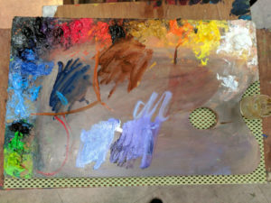
How to organize the palette
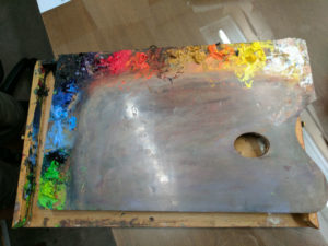
The palette is like the command center of painting and is worth mentioning here. The palette is often a reflection of the painting. If the palette is all mixed up in greyish tone colors, you can envision a greyish tone painting on the canvas. My palette is usually arranged as follows: Top right corner – black on the left and white on the right; lower left is green and other neutral colors. When painting, the mixed colors are generally arranged in the order of the color wheel and divided into several regions.
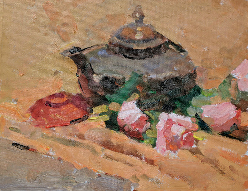
How to observe color
The key to the honing of plein-air color ability is the observation of color. Color observations means to find and establish the color relationship. There are three types of color relationship that we need to identify.
- Find the difference between large color blocks
- Find the difference between the colors of large color blocks
- Identify the tone: Tone generally refers to a dominant or common color in the image; tone is also a visual effect created by most objects being illuminated by light of a particular color; color has a hierarchy and they all coordinate with each other.
Basically, one must establish the value and temperature of the colors.
The key to color observation is a quick glance instead of a long gaze. It is a scanning action where the gaze does not rest on a particular point or place. It’s like two young people sneaking glances of each other on their first date. A lot can be learned through that glance. It gives you the object’s color character and the color relationship between objects. This observation method is based on “feel.” What’s wrong with “staring?” If you stare at something for a long time, the colors feel less bright. The contracts between the colors of different color blocks are then weakened. The most important training in plein-air color paintings is the observation and feeling of the colors.
How to paint and mix color
Observe→ Mix colors → Paint. Observe again → Mix colors again → Paint again. The brighter parts usually need two to three applications of color.
Common approach:
- Go from the dark to the light colors. Don’t let white-based colors take over.
- Go from large color blocks (regions) to small color blocks.
- Go from thin colors to thick colors (thin is recommended for dark colors, and light colors should be thick)
Keep in mind:
- A quick eye is necessary when observing colors. Go with your feeling at that instant rather than stare at it.
- The palette should have separate areas for the bright and dark parts when mixing colors. New mixed colors should be placed next to original colors to make color comparison easier and to keep the palette organized.
- If painting large color blocks, mix up enough of the basic color for the entire block in one go. The fine changes in color within the color block should also be mixed and placed around the basic color. This will ensure the stability of the large color block when painting while still capturing its finer variations. You will not have to adjust the color after every brush stroke either.
- Mix some middle tone colors on the palette by adding a little white into dark colors (blue, green, violet, etc.) for later use. These can be used as transition colors when making fine adjustments. This technique is particularly important when painting the skin tones of characters.
- When the palette becomes crowded or the colors feel muted, scrape it clean and tidy things up so you can find the bright tones once more.
For information on oil painting video lessons, please click here.

Thank you for sharing this valuable and useful experience. I am very appreciated the beauty of color in Master Yim,s paintings。
You’re very welcome! We’re glad that you found it helpful.
Thank you for taking the time to send this information.
You’re welcome! We hope it’s helpful.
Thank you very much for this valuable lessons. I want to know whether and when he comes to Washington DC area for lecturing
Hi, Sung Ho, we’re glad that you found the video helpful. Mr. Yim currently doesn’t travel internationally for health reasons. Iris
Would you share your palette?
I have your books and love them
We have sent an e-mail with the palette list to you. Warm regards, Iris